このページにはプロモーションが含まれています。

はじめに
今回は、CSSのレイアウトモジュールであるFlexbox(フレックスボックス)についてお話します。
Flexboxが使えると、複雑なレイアウトも簡単に組みやすくなり、
コーディングする際、柔軟に対応でき、効率的に行えます。
ぜひ一緒に使い方をマスターしましょう!
- Flexboxの書き方
- レイアウトの並べ方の種類と指定する方法
Flexboxの書き方
Flexboxでレイアウトを組む際、必要になる記述があります。
この点を覚えると、コーディングが楽になるのでぜひ習得しましょう!
Flexboxの書き方の基本形は、以下の2点です。
- 親要素にdisplay:flexを記述する
- 親要素に水平方向・垂直方向のレイアウトの指定を記述する
そうすると、子要素のレイアウトを扱えるようになります。
親要素への記述
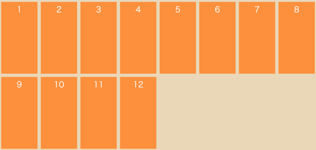
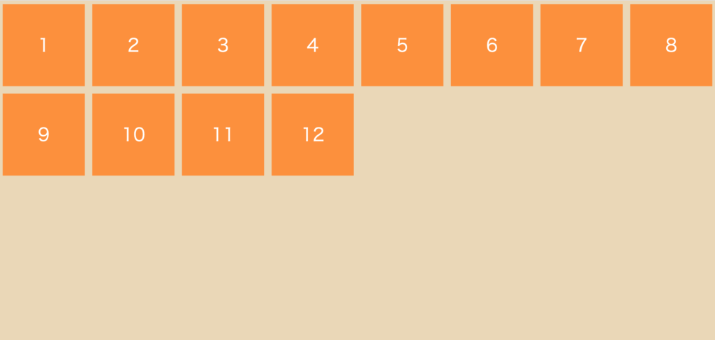
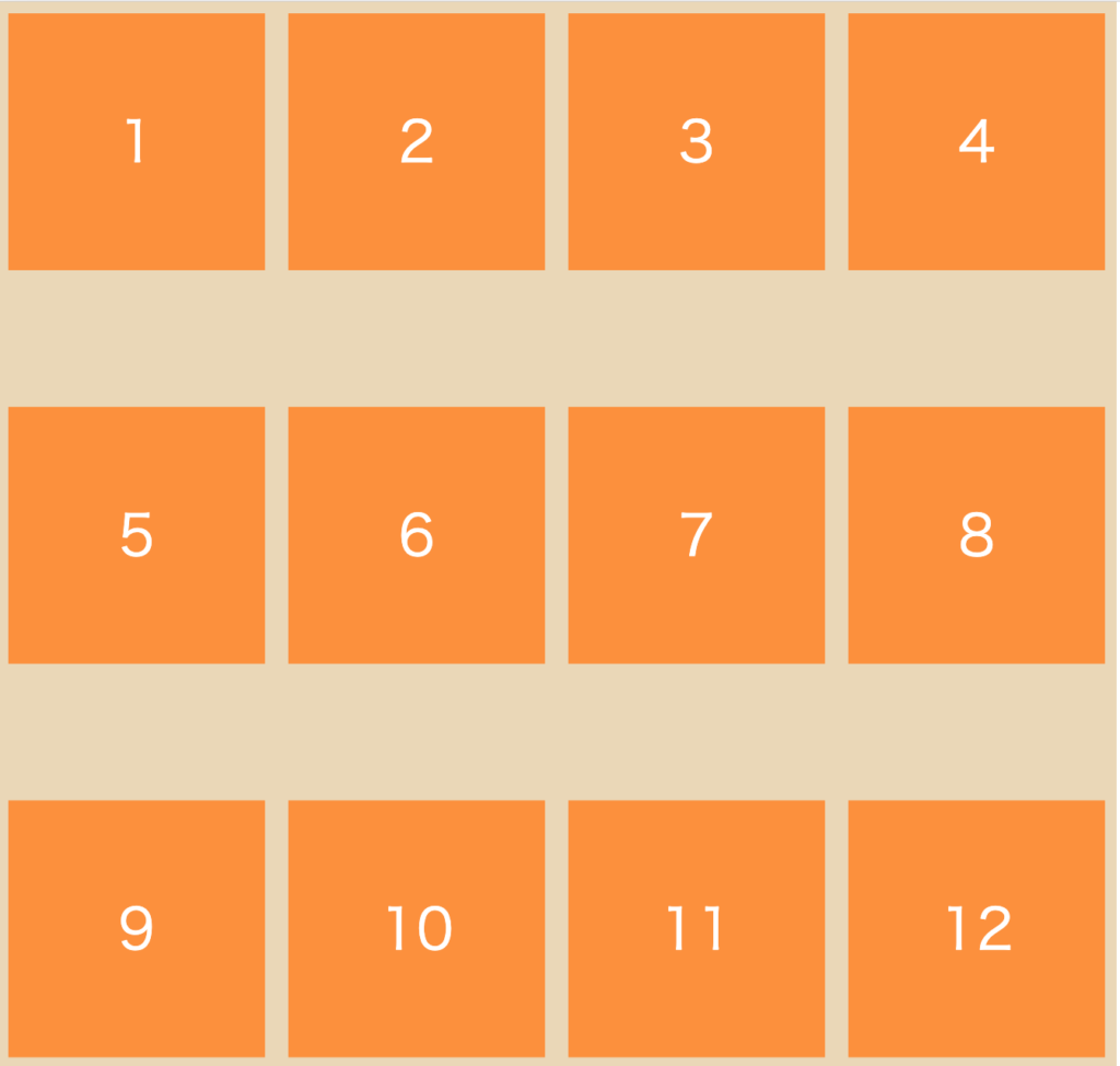
シンプルな例で実際に見ていきましょう。
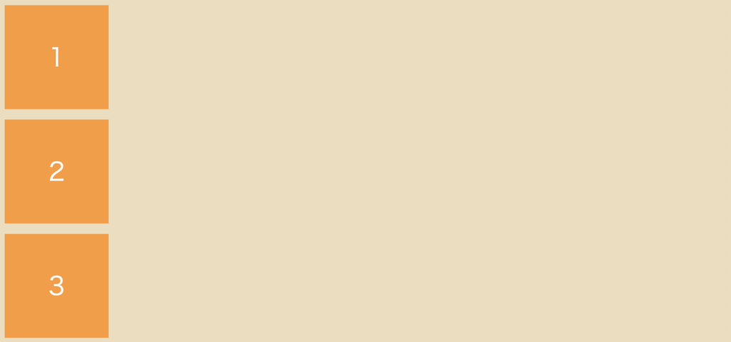
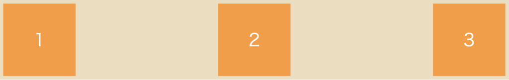
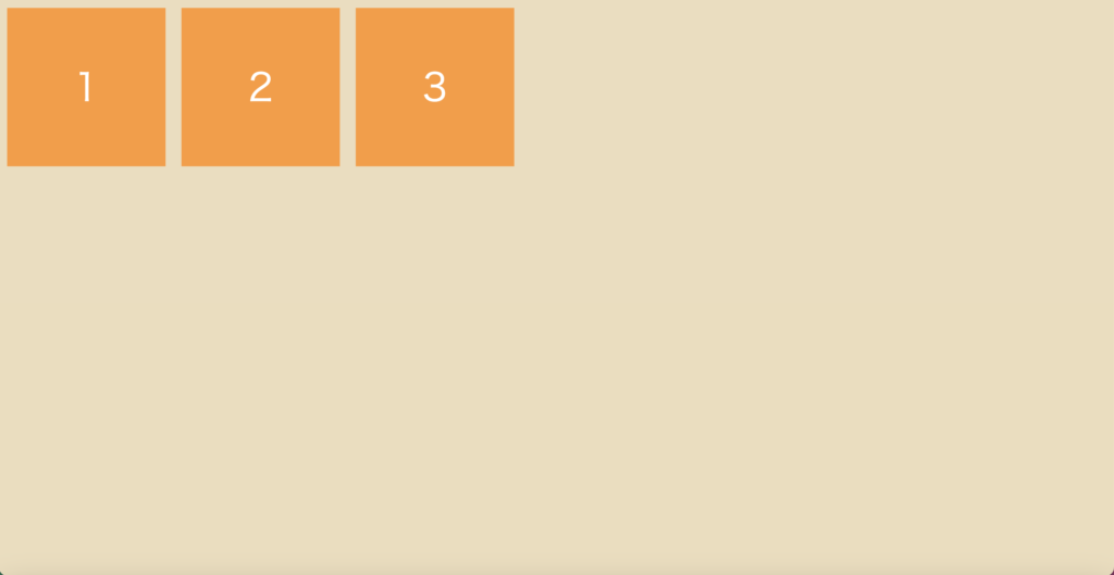
親要素「flex-container」に対して
子要素「flex-item」が3つの構造です。
<div class="flex-container"><!--親要素-->
        <div class="flex-item">1</div><!--子要素1-->
        <div class="flex-item">2</div><!--子要素2-->
        <div class="flex-item">3</div><!--子要素3-->
</div>
.flex-container {
display: flex; /* check!! */
}
/*ここからレイアウトのためのCSSです*/
body {
margin: 0 auto;
}
.flex-container {
text-align: center;
line-height: 200px;
background-color: #eddcbc;
}
.flex-item {
width: 200px;
height: 200px;
margin: 10px;
padding: 10px;
font-size: 48px;
color: #fff;
background-color: #ff9933;
}
/*ここまでレイアウトのためのCSSです*/
親要素に「display: flex;」と記述しました。
上記の記述で、子要素の「flex-item」を簡単に横並びにできましたね!
レイアウトの並べ方の種類と指定する方法
さらにプロパティを記述することで、レイアウトの並べ方を指定できます。
レイアウトの種類をご紹介します。
- flex-direction
- flex-wrap
- justify-content
- align-items
- align-content
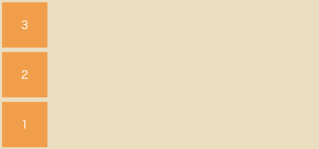
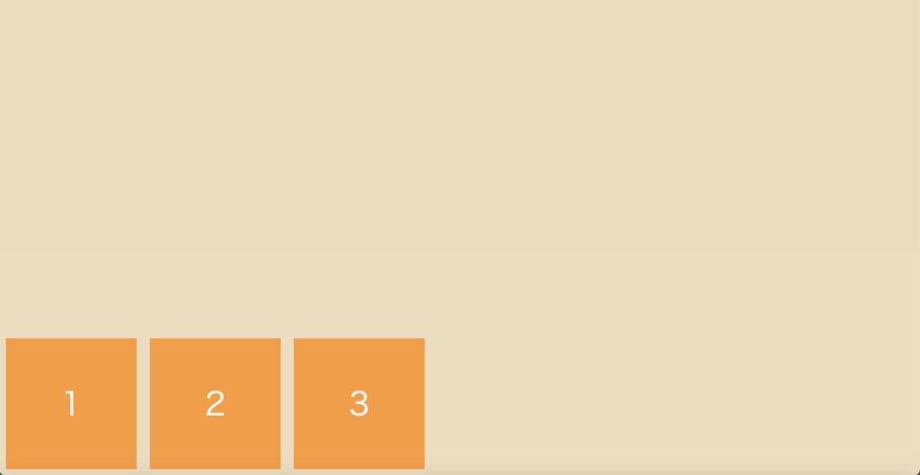
並ぶ向きの指定:flex-direction
プロパティflex-directionに値を与えると、
以下のように「横並び」か「縦並び」にできます。
〇〇-reverseで「逆向き」にもできます。
| 値 |
| row(初期値) |
| row-reverse |
| column |
| column-reverse |
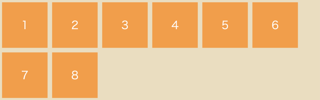
row(初期値)

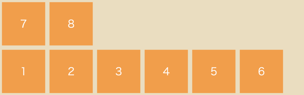
row-reverse

column
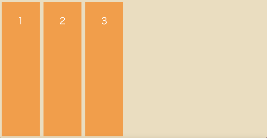
column-reverse
折り返しの指定:flex-wrap
プロパティflex-wrapに値を与えると、
以下のように「1行に並べる」か「複数行に折り返す」かを指定できます。
| 値 |
| nowrap(初期値) |
| wrap |
| wrap-reverse |
nowrap(初期値)
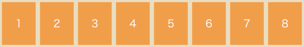
wrap
wrap-reverse
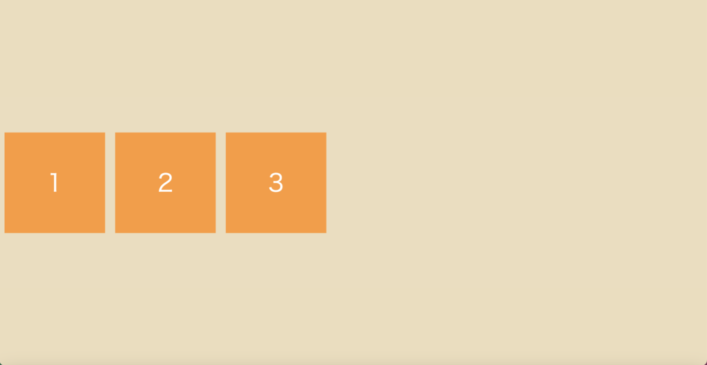
水平方向の指定:justify-content
プロパティjustify-contentに値を与えると、
以下のように水平方向のどこに配置するかを指定できます。
| 値 |
| flex-start(初期値) |
| flex-end |
| center |
| space-between |
| space-around |
flex-start(初期値)
flex-end

center

space-between
space-around

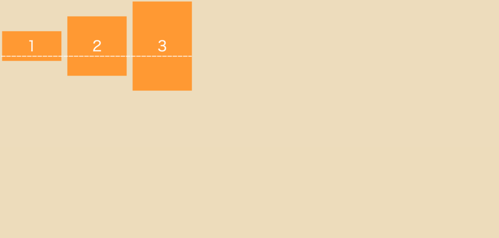
垂直方向の指定:align-items
プロパティjustify-contentに値を与えると、
以下のように垂直方向のどこに配置するかを指定できます。
| 値 |
| stretch(初期値) |
| flex-start |
| flex-end |
| center |
| baseline |
stretch(初期値)
flex-start
flex-end
center
baseline
複数行の揃え方の指定:align-content
プロパティalign-contentに値を与えると、
以下のように子要素が複数行の場合に、垂直方向のどこに配置するかを指定できます。
複数行の指定がある場合に適用されます。
.flex-container {
    display: flex;
    flex-wrap: wrap; /* 複数行に折り返す */
    align-content: space-around; /* 配置の指定 */
}| 値 |
| stretch(初期値) |
| flex-start |
| flex-end |
| center |
| space-between |
| space-around |
stretch(初期値)
flex-start
flex-end
center
space-between
space-around
space-betweenは、両端寄せ(上下や左右)をして均等に配置するのに対して、
space-aroundは、両端も含めて均等に配置する
HTML/CSS おすすめの書籍
HTML/CSSの基本をもっと勉強したい方に
おすすめの本はこちらです。
おわりに
ここまで、Flexboxの様々なプロパティについて見てきました。
今回のコードを活用して、ぜひご自身でプロパティを変えて表示してみてください。
この記事が学習のお役に立てたら嬉しいです。
 はなまる
はなまる便利なFlexbox。
使ってみてください!


コメント